Describing Images for Enhanced Assessments
Example Pie Charts
Pie Chart Example 1

How to describe this image:
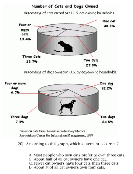
Pie charts should be converted in to lists or data tables. These charts are very simple so they can be converted into lists.Ignore extraneous visual elements such as the pictures of the cat and the dog, the 3D shape of the pie charts and the red lines.
Description:
Two pie charts show the Number of Cats and Dogs Owned.Percentage of cats owned per U.S. cat-owning households.
One cat: 48.0%
Two cats: 27.9%
Three cats: 10.7%
Four or more cats: 13.4%
Percentage of dogs owned per U.S. dog-owning households.
One dog: 62.2%
Two dogs: 24.5%
Three dogs: 7.0%
Four or more dogs: 6.3%
Top of Page
Pie Charts Example 2

How to describe this image:
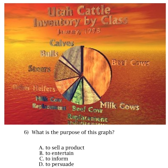
This is a simple pie chart disguised by visual clutter, which is meant to test a student's skill in cutting through extraneous information and determining the purpose of the pie chart. So, if we apply the typical description solution, we will defeat the purpose of the question. Therefore, considering the context, we should include some of the visual clutter in our description to be true to purpose of the question.Description:
A colorful pie chart is shown with a background of a sunset over the ocean.The title of the pie chart is: Utah Cattle, Inventory by Class, January 1998.
The pie wedges are different colors, textures and sizes.
The largest pie wedge is bright orange and labeled Beef Cows.
Moving clockwise the wedges labeled: Beef Cows, Milk Cows, Beef Cow replacement, Milk Cow replacement, Older Heffers, Steers, Bulls and Calves.
Return to Examples List
Funding for this project is from the U.S. Department of Education to the Utah State Office of Education under Grant Award #S368A090019. Any opinions, findings, and conclusions or recommendations are those of the project team and do not necessarily reflect those of the U.S. Department of Education.
