Effective Practices for Description of Science Content within Digital Talking Books
Example B: Line Graphs
PREVIOUS | NEXT | CONTENTS
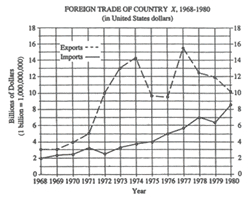
The figure is entitled "FOREIGN TRADE OF COUNTRY X, 1968 through 1980, in United States dollars". There are two lines on the graph, a dashed line labeled "Exports" and a solid line labeled "Imports".
The vertical axis is labeled "Billions of Dollars," beginning with zero to eighteen, in increments of 2. A note: one billion equals a one followed by 9 zeros.
The horizontal axis is labeled "Year" and lists all the years from 1968 through 1980.
In the graph, the Exports line begins in 1968 at 3 billion dollars, rises steeply to 14 billion in 1974, then drops to 9.5 billion in 1975 and 1976. In 1977, the Exports line shoots up to 15.5 billion, then trails off to 10 billion in 1980.
In the graph, the Imports line begins in 1968 at 2 billion and rises steadily to 8.75 billion in 1980, except for minor dips in 1972 and 1979.
The data are summarized in the following table. Figures are in billions of dollars. All data are approximate.
PREVIOUS | NEXT | CONTENTS
Funding for this project is provided by the National Science Foundation.
Guidelines:
- Line graphs should be converted into accessible tables.
- Briefly describe the chart and give a summary if one is immediately apparent.
- Provide the title and axis labels.
- It is not necessary to describe the visual attributes of the lines, e.g. solid, dashed, unless there is an explicit need such as an exam question referring to these attributes. In this case, with just two lines, the added description is not a burden to the reader.
Description:
The figure is entitled "FOREIGN TRADE OF COUNTRY X, 1968 through 1980, in United States dollars". There are two lines on the graph, a dashed line labeled "Exports" and a solid line labeled "Imports".
The vertical axis is labeled "Billions of Dollars," beginning with zero to eighteen, in increments of 2. A note: one billion equals a one followed by 9 zeros.
The horizontal axis is labeled "Year" and lists all the years from 1968 through 1980.
In the graph, the Exports line begins in 1968 at 3 billion dollars, rises steeply to 14 billion in 1974, then drops to 9.5 billion in 1975 and 1976. In 1977, the Exports line shoots up to 15.5 billion, then trails off to 10 billion in 1980.
In the graph, the Imports line begins in 1968 at 2 billion and rises steadily to 8.75 billion in 1980, except for minor dips in 1972 and 1979.
The data are summarized in the following table. Figures are in billions of dollars. All data are approximate.
| Year | Exports | Imports |
|---|---|---|
| 1968 | 3 | 2 |
| 1969 | 3 | 2.3 |
| 1970 | 4 | 2.4 |
| 1971 | 5 | 3.1 |
| 1972 | 10 | 2.5 |
| 1973 | 13 | 3.3 |
| 1974 | 14.2 | 3.7 |
| 1975 | 9.7 | 4 |
| 1976 | 9.5 | 5 |
| 1977 | 15.5 | 5.7 |
| 1978 | 12.5 | 7 |
| 1979 | 12 | 6.3 |
| 1980 | 10.2 | 8.6 |
PREVIOUS | NEXT | CONTENTS
Funding for this project is provided by the National Science Foundation.

