Effective Practices for Description of Science Content within Digital Talking Books
Example D: Scatter Plots
PREVIOUS | NEXT | CONTENTS
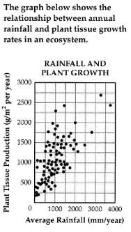
The graph is a scatter plot, entitled "Rainfall and Plant Growth."
The horizontal X axis shows Average Rainfall ranging from zero to four thousand, in units of millimeters per year, in increments of one thousand.
The vertical Y axis shows Plant Tissue Production in units of grams per meter squared per year, ranging from zero to three thousand, in increments of five hundred.
The graph has approximately 85 points scattered in a pattern beginning in the lower-left corner where Plant Tissue Production and Average Rainfall are the lowest. The pattern extends toward the upper-right corner where Plant Tissue Production and Average Rainfall are the highest.
The majority of points are concentrated in the lower-left corner and diminish in concentration as the pattern extends toward the upper-right corner.
PREVIOUS | NEXT | CONTENTS
Funding for this project is provided by the National Science Foundation.
Guidelines:
- Scatter plots are among the more difficult graphs to describe, especially if there is a need to make specific data point accessible.
- Provide the title and axis labels.
- Identify the image as a scatter plot and focus on the change of concentration.
- If it is necessary to be more specific, convert the data into an accessible table.
Description:
The graph is a scatter plot, entitled "Rainfall and Plant Growth."
The horizontal X axis shows Average Rainfall ranging from zero to four thousand, in units of millimeters per year, in increments of one thousand.
The vertical Y axis shows Plant Tissue Production in units of grams per meter squared per year, ranging from zero to three thousand, in increments of five hundred.
The graph has approximately 85 points scattered in a pattern beginning in the lower-left corner where Plant Tissue Production and Average Rainfall are the lowest. The pattern extends toward the upper-right corner where Plant Tissue Production and Average Rainfall are the highest.
The majority of points are concentrated in the lower-left corner and diminish in concentration as the pattern extends toward the upper-right corner.
PREVIOUS | NEXT | CONTENTS
Funding for this project is provided by the National Science Foundation.

