Effective Practices for Description of Science Content within Digital Talking Books
Example I: Complex Diagrams and Illustrations
PREVIOUS | NEXT | CONTENTS

Back to Top

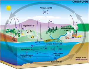
The diagram is titled "Carbon Cycle." Colorful pictures depict farms, forests, rivers, oceans and industry. Four arrows encircle the diagram, representing the cycling of carbon. Smaller arrows illustrate Storage of Carbon and Fluxes in Carbon through Earth's atmosphere, oceans and land. Amounts are measured in G t C - gigatons of carbon.
Carbon Storage and Annual Fluxes in Carbon are depicted in the following tables.
Back to Top
PREVIOUS | NEXT | CONTENTS
Funding for this project is provided by the National Science Foundation.
Illustrated Chart

Guidelines:
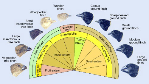
- The various relationships between the finches can be replicated in a table.
- This is a case in which the table requires more work to discern the relationships than the illustration does. A b/vi person would have to review the table several times to establish the patterns that a sighted person sees almost instantly. However, the table does allow for quick review of data which a narrative-style description would not.
- This table, like all tables, can be rendered differently. In this case, the alternate would be to have the categories run down the left-hand column instead of across the top row. Compare the two tables.
- If the colors of the finches' feathers are important, an additional column can be added to the table.
Description:
An illustration showing 10 different finches and their variations is depicted in the following table.| NAME | FINCH | BILL | FOOD |
|---|---|---|---|
| Vegetarian tree finch | Tree finches | Parrot-like bills | Fruit eaters |
| Large insectivorous tree finch | Tree finches | Grasping bills | Insect eaters |
| Small insectivorous tree finch | Tree finches | Grasping bills | Insect eaters |
| Woodpecker finch | Tree finches | Probing bills | Insect eaters |
| Warbler finch | Warbler finch | Probing bills | Insect eaters |
| Cactus ground finch | Ground finches | Probing bills | Cactus eaters |
| Sharp-beaked ground finch | Ground finches | Crushing bills | Seed eaters |
| Small ground finch | Ground finches | Crushing bills | Seed eaters |
| Medium ground finch | Ground finches | Crushing bills | Seed eaters |
| Large ground finch | Ground finches | Crushing bills | Seed eaters |
Back to Top
Diagram with Embedded Data

Guidelines:
- Despite the beauty of this illustration, its main purpose is to show the storage fluxes in carbon. The data are easily laid out in tables.
- While the illustration itself is colorful and visually interesting, it doesn't provide additional information beyond the labels and numbers. Indeed, some survey participants commented that the description provided below was excessive and that only the tables were needed. As always, the description provider must determine both the intent of image and the intended audience.
Description:
The diagram is titled "Carbon Cycle." Colorful pictures depict farms, forests, rivers, oceans and industry. Four arrows encircle the diagram, representing the cycling of carbon. Smaller arrows illustrate Storage of Carbon and Fluxes in Carbon through Earth's atmosphere, oceans and land. Amounts are measured in G t C - gigatons of carbon.
Carbon Storage and Annual Fluxes in Carbon are depicted in the following tables.
| Storage Area | G t C |
|---|---|
| Atmosphere | 750 |
| Vegetation | 610 |
| Fossil Fuels and Cement Production | 4,000 |
| Soils | 1,580 |
| Surface Ocean | 1,020 |
| Deep Ocean | 38,100 |
| Marine Biota | 3 |
| Underwater Dissolved Organic Carbon | less than 700 |
| Ocean Sediments | 150 |
| Flux | G t C |
|---|---|
| Atmosphere to Vegetation | 121.3 |
| Vegetation to Atmosphere | 60 |
| Soils to Atmosphere | 60 |
| Forest Fires to Atmosphere | 1.6 |
| Atmosphere to Evergreen Forest | .5 |
| Fossil Fuels and Cement Production to Atmosphere | 5.5 |
| Surface Ocean to Atmosphere | 90 |
| Atmosphere to Surface Ocean | 92 |
| Surface Ocean to Marine Biota | 50 |
| Marine Biota to Surface Ocean | 40 |
| Marine Biota to Dissolved Organic Carbon | 6 |
| Marine Biota to Deep Ocean | 4 |
| Surface Ocean to Deep Ocean | 91.6 |
| Deep Ocean to Surface Ocean | 100 |
| Dissolved Organic Carbon to Deep Ocean | 6 |
| Deep Ocean to Ocean Sediments | .2 |
Back to Top
PREVIOUS | NEXT | CONTENTS
Funding for this project is provided by the National Science Foundation.
